A couple of weeks ago, I spent some time on Canva design tutorials. One of the topics was font as in matching font to message and making things interesting but readable.
Imagine my surprise when my husband sent me an article he had spotted, “Sans Forgetica: The font scientists created to help you recall what you read.” What it comes down to is this – there is a reason that people don’t learn as well as they should. We make it to easy for them. What you need to employ is desirable difficulty. If they have to put a bit of effort into acquiring the knowledge, they are more likely to retain it.
Whether or not you accept this theory, it is an interesting idea. I’m a big believer in the idea that you tend to appreciate things if you put some effort into getting them. But how does that apply to font?
A team of designers and behavioral scientists from RMIT University in Melbourne, Australia worked to create a series of fonts that are more difficult to read. They then tested these fonts on approximately 400 Australian university students. The results showed that one font, which the developers named Sans Forgetica was legible enough that people could read it but difficult enough to encourage deeper mental processing and, through this, better retention.
Here is a list I was given to commit to memory this week.
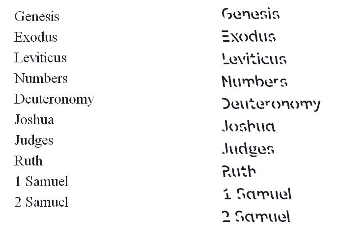
What do you think? Will reviewing it typed out in Sans Forgetica help?
–SueBE

At first glance, I find it harder to read, SueBe. I think it would actually slow my reading speed down. What did you think?
Ruth,
I think that’s the point. Slower, more intentional reading = learning and remembering.
Not sure that I buy it, but that is their point.
–SueBE